Business Analytics & Visualization
Your business collects massive amounts of operational data every day. Collecting and analyzing these data can be an intimidating task. Let Workflow Solutions use business intelligence software to build interactive dashboards to report on and analyze key metrics. Scroll down for two examples, an organizational key metrics (KPI) dashboard and an interactive employee scorecard.
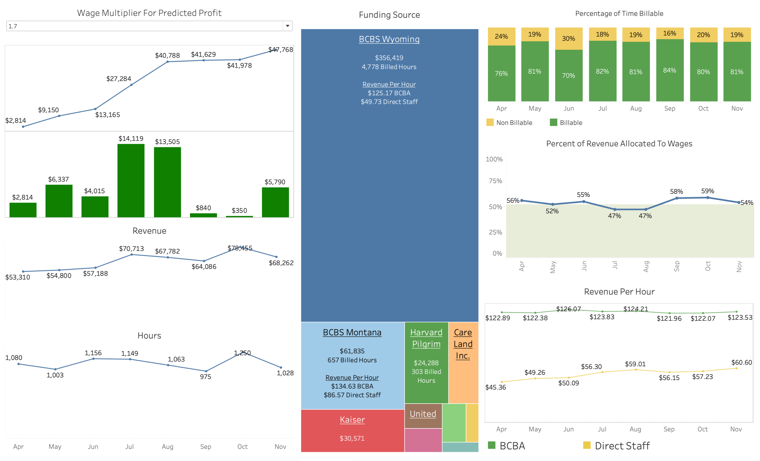
Organizational Dashboard
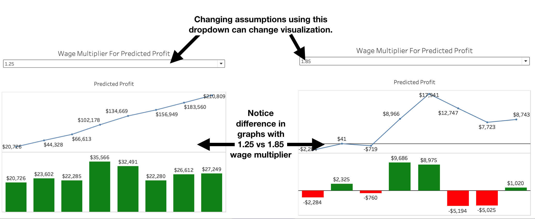
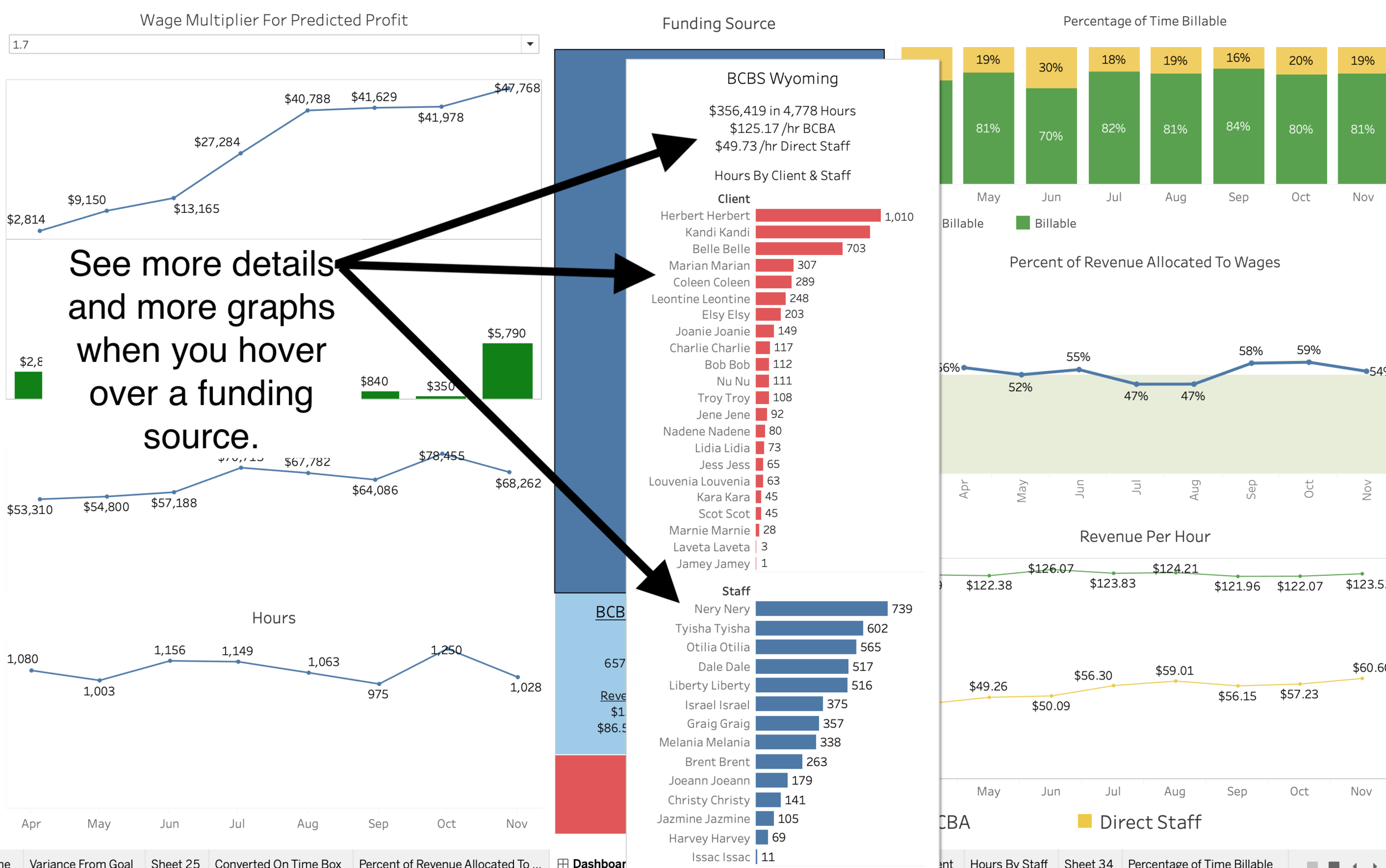
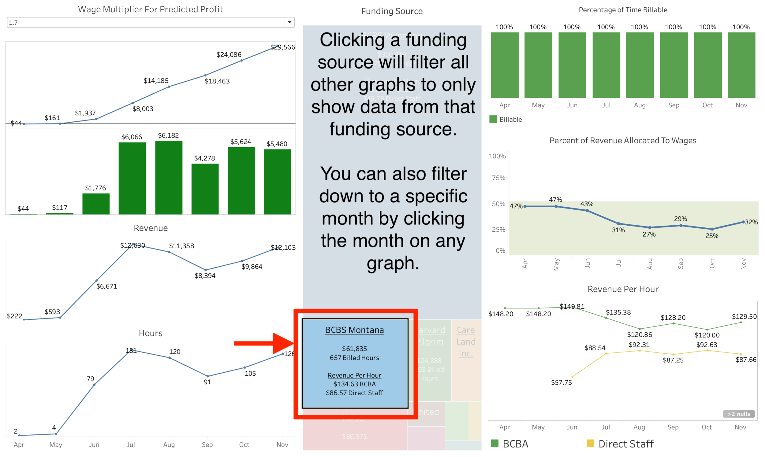
A simple organizational KPI dashboard is displayed below. This dashboard contains 7 distinct visualizations with additional information displayed when you hover, the ability to change assumptions, and ability to filter data by clicking on specific funding source. Visualizations include…
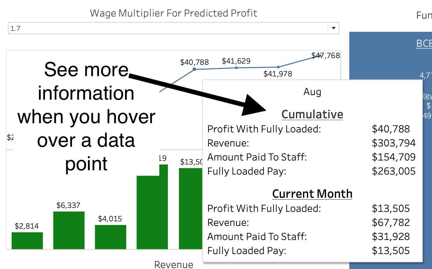
Predicted profit with ability to change assumptions regarding a wage multiplier (i.e., how much do you want to multiply wages by when comparing to revenue).
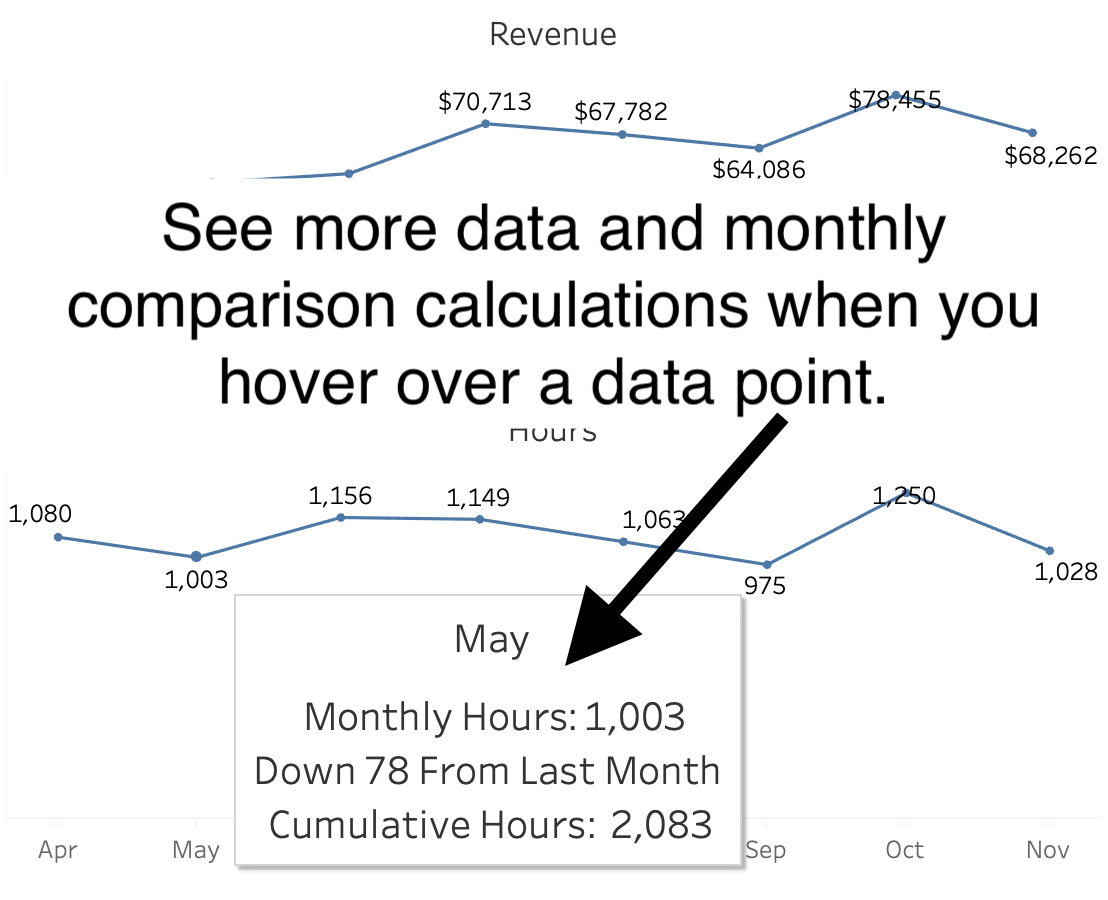
Revenue per month
Hours per month
Funding source with revenue, hours, revenue per hour for BCBA, and revenue per hour for direct staff displayed. Ability to hover and see graphs for hours billed by staff and client. Also, ability to click on a specific funding source to show only data from that funding source in all other graphs.
Percent of hours billable by month
Percent of revenue allocated to wages by month
Revenue per hour for BCBA and Direct Staff by month.
Click through pictures below to see sample organization dashboard with annotations.
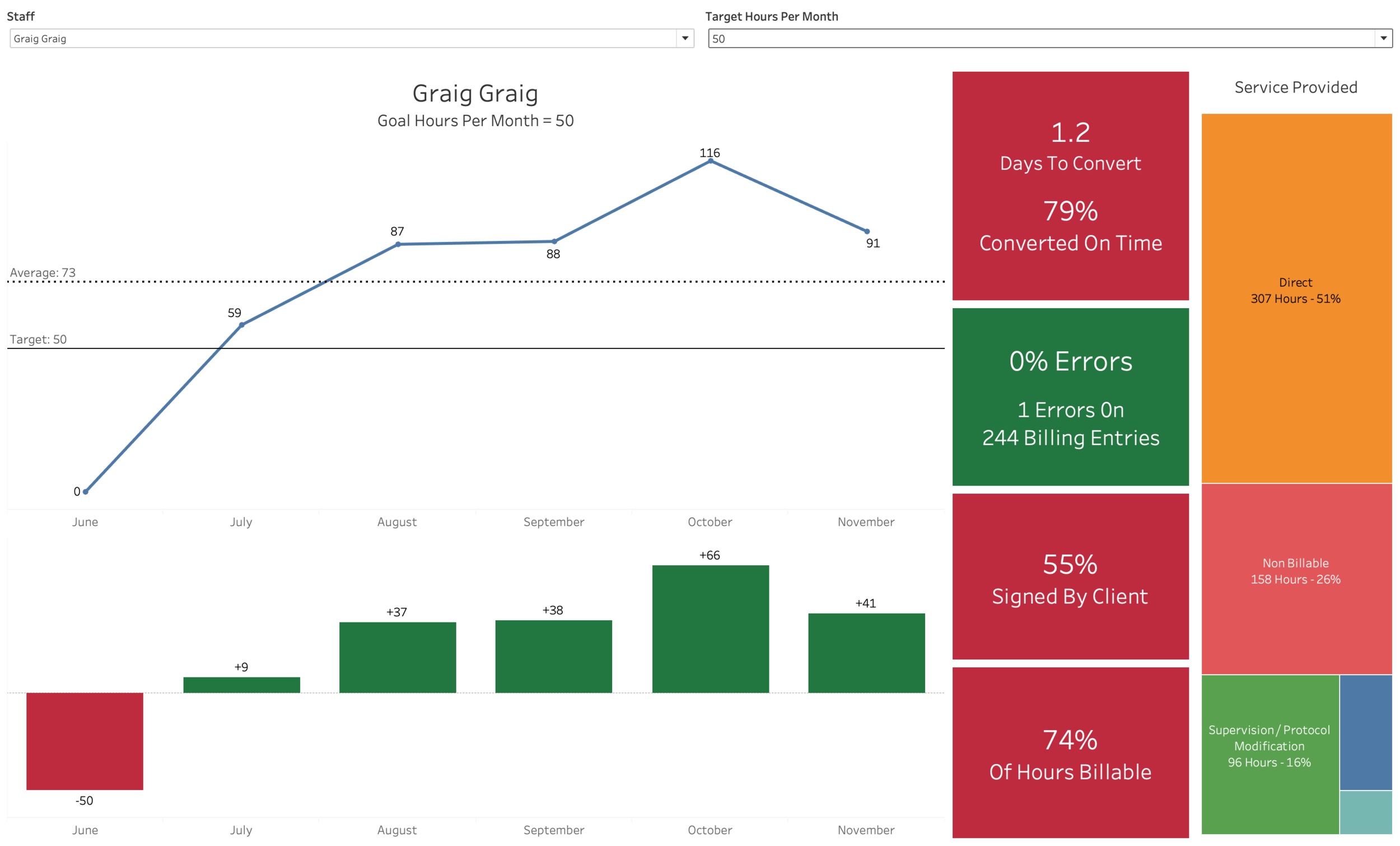
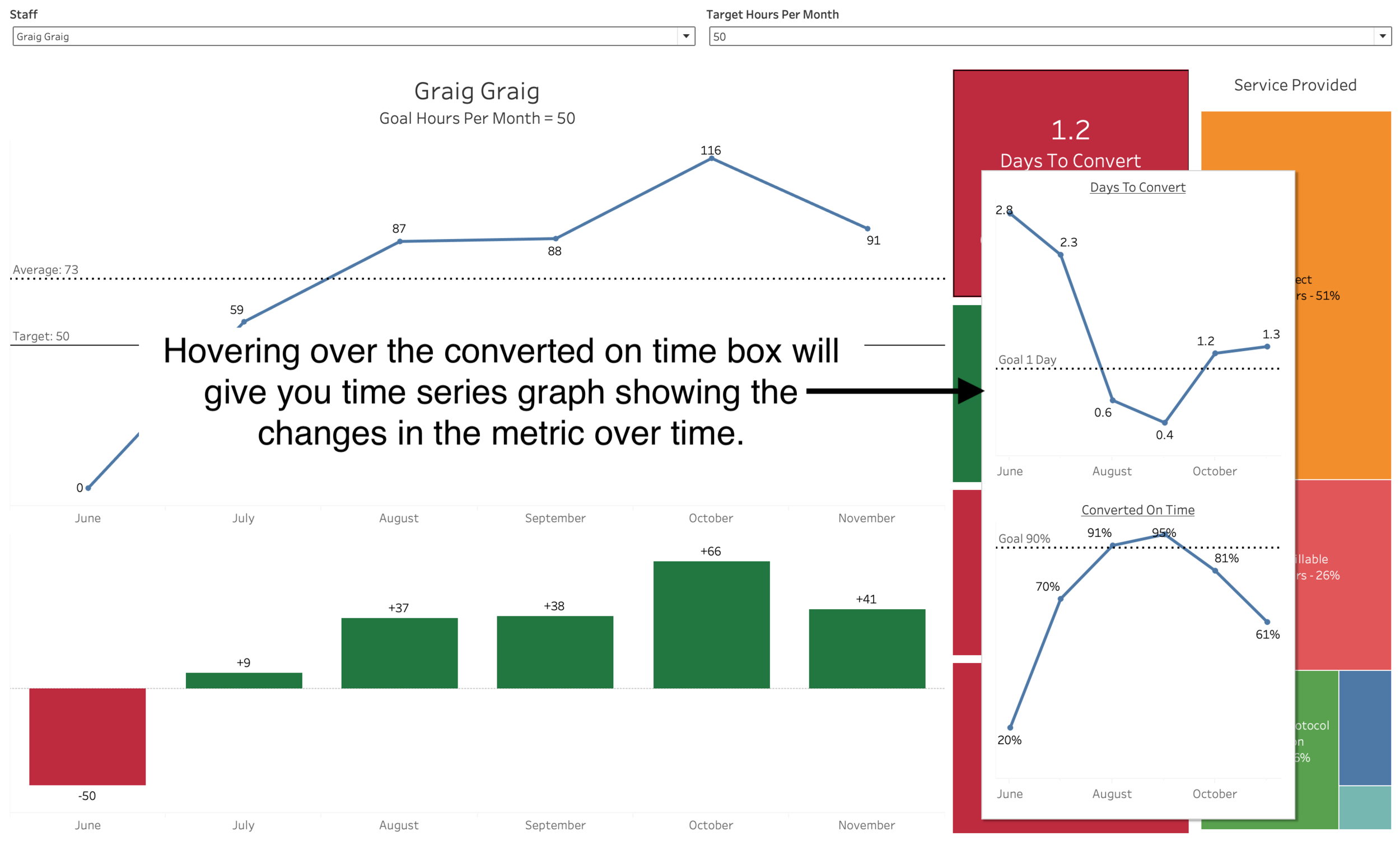
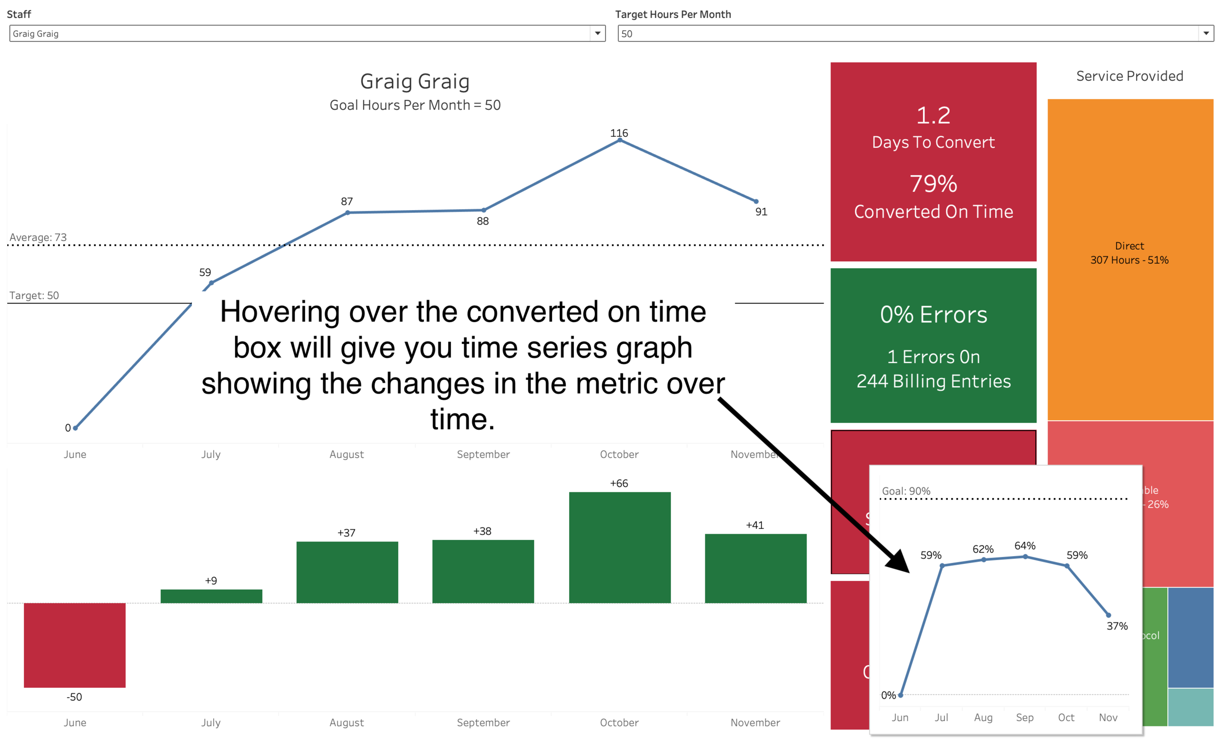
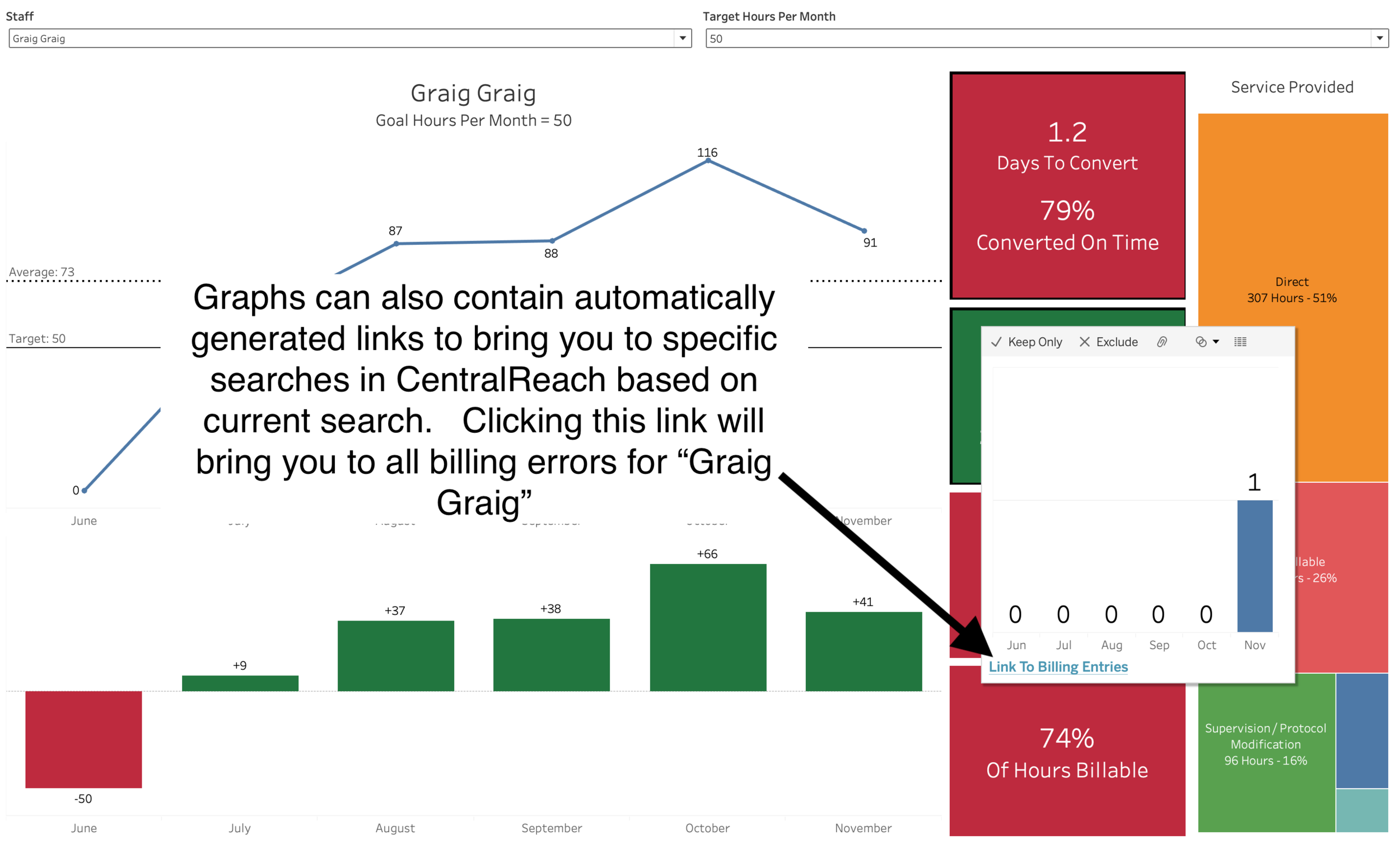
Employee Scorecard
Have interactive employee scorecards delivered to your inbox weekly, monthly, or at any cadence you choose. The carousel of photos below walks you through a sample employee scorecard with the following features…
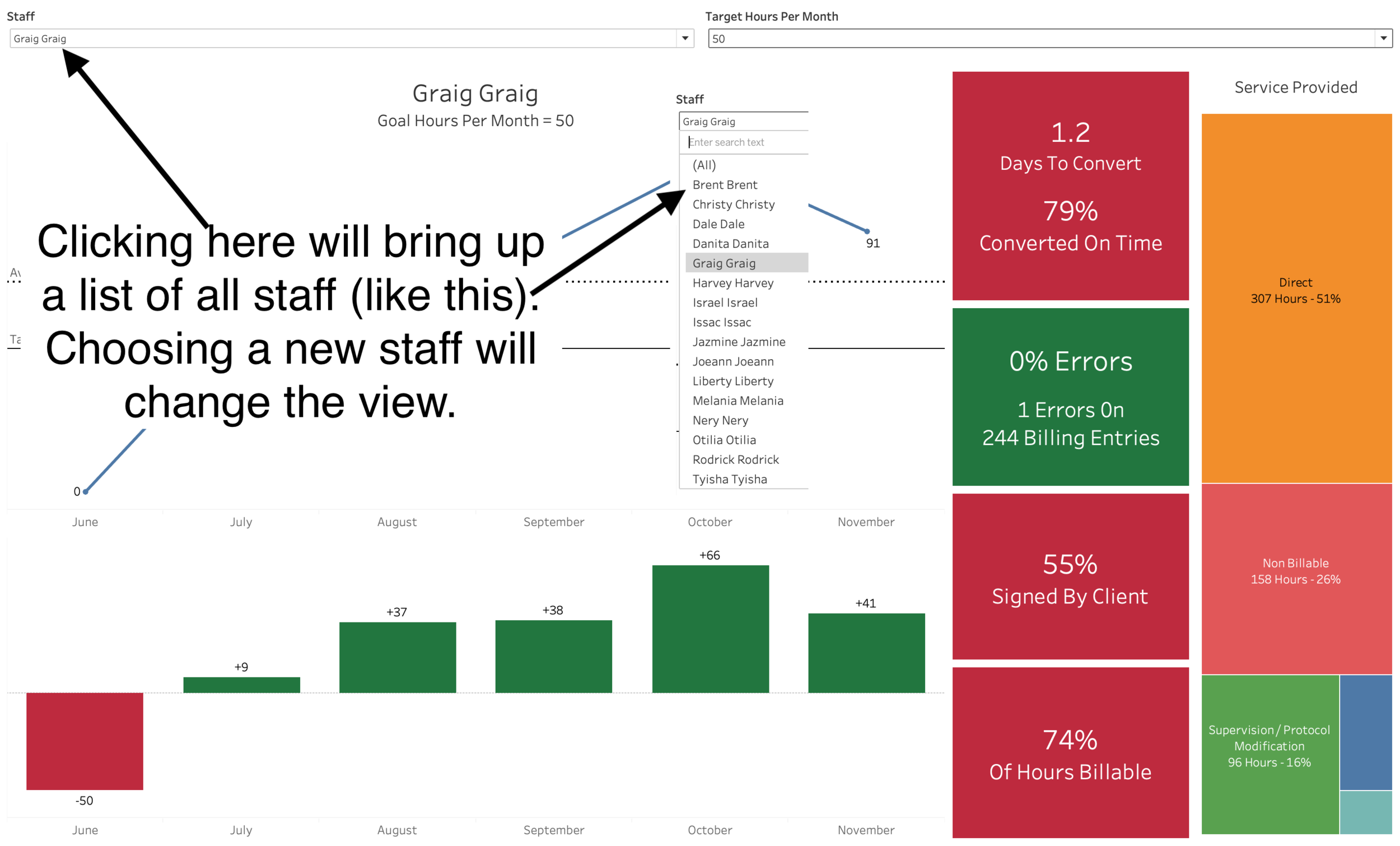
Dropdown to change staff
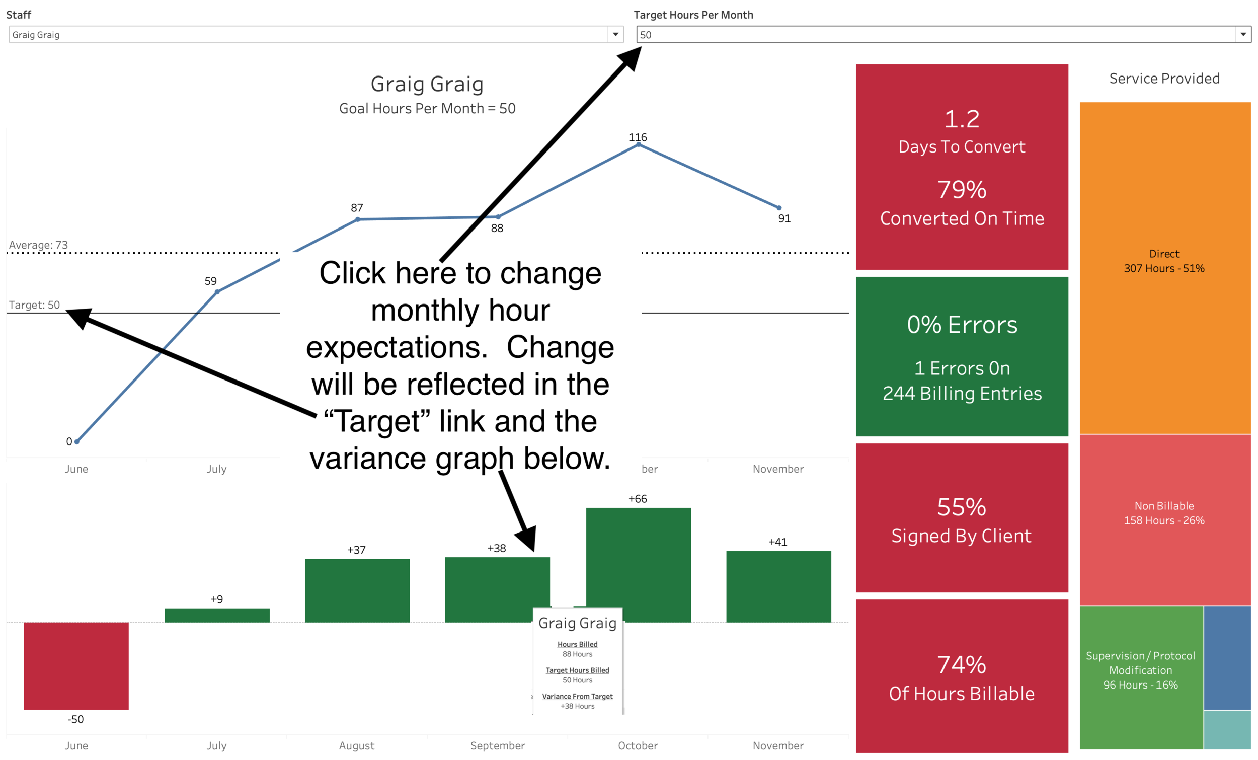
Dropdown to change monthly target hours
Graph of billable hours per month (with target and average lines)
Graph displaying monthly comparison of target vs billed hours
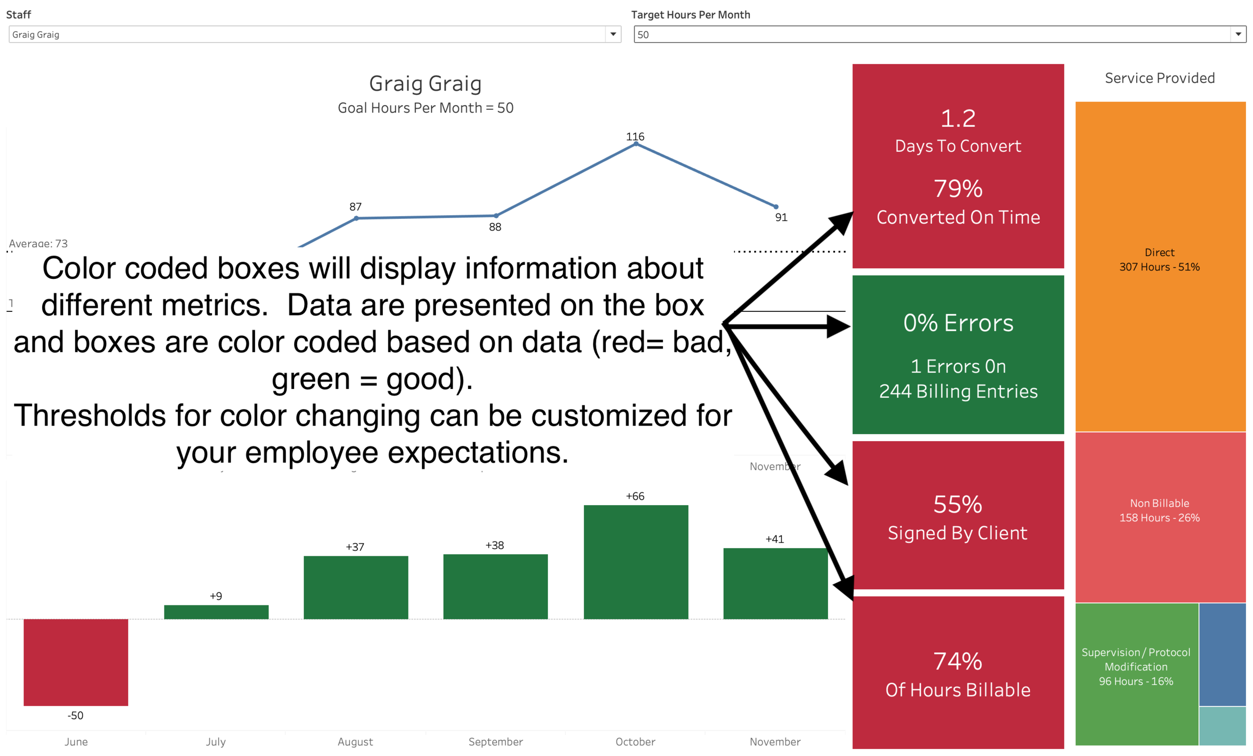
Four color coded metrics with time series graphs displayed when you hover
Converting on time
Errors on billing entries
Timesheets signed by client
Percent of time billable
A visualization indicating how staff spends their time
Click through pictures below to see sample scorecard with annotations.